⟵ Back to Home
Troo - Securing investor funding with a realistic and animated concept app design
Working towards securing additional investor funding and supporters for the MVP using collaborative concept app designs and animations to include in the website redesign.
Team
Creative Director, UX & Product Designers, Product Manager, UX Researchers, UX Writer, Data Analyst, CEO
Tools
Figma, Trello, Adobe Photoshop
Timeline
4 months
Troo.co homepage
Troo.co Website

Overview

Troo Co. is on a mission to create an ethical social media platform. To secure additional investor funding, Troo wanted to refresh its website and include sample screens of the social media platform to showcase what makes Troo different.

Role + Impact

The Creative Director tasked us, an agile team of UX and Product Designers, with designing concept app screens and coming up with animations to showcase the prototypes in action. By adding these to a newly redesigned website, Troo hopes to gain investors and founding users to support Troo as we create an MVP. We accomplished this by:
Skip to Section

Problem Statement

Design a concept app to showcase on Troo’s website that is:
First
Simple enough to understand what sets Troo apart
Second
Exciting enough to bring interest
Third
Positively impactful on users’ psychology
Not doing so would mean less funding for Troo and a lack of founding users to generate interest on the platform once the MVP is launched.
Given that we were on a timeline, I relied on research conducted by the UX Research team and earlier correspondences between past teammates to gain insight when designing.

IDEATION

Moodboard

Troo Moodboard Inspiration Excerpt
Moodboard Inspiration Excerpt
Each member on the UX team contributed images, colors, ideas, and videos/GIFs to the mood board to share ideas in the topics we thought were important, such as what to include or exclude. Once we all had contributed, we went through the ideas together as a team.

Benefits

Align Visions
Creating a mood board helped keep our designs aligned with Troo’s mission and team vision
IDEATE
Looking for ideas helped us quickly familiarize ourselves with competitor styles and features
DISCUSS
Presenting our contributions gave us time to discuss and hear teammate viewpoints

Translating Troo’s values into design choices

Troo's Values and what UX Design principle was used to address that

Sketches

Image of wireframe sketches with preferred elements highlighted and requirements added to the margins
Dashboard / Home Screen Sketches
I listed requirements to include in my sketches on the right as a reminder. I highlighted design elements in pink that I would include in my wireframes. I chose these to support Troo’s values through the use of UX principles.
While, at first, I felt very overwhelmed with the task at hand with not much direction, I found that the following factors helped me quickly come up with ideas and feel confident:
Reviewing all previous information
Keeping a list of things to include/exclude
Sketching out ideas on paper to get a feel for things without committing
Picking elements I liked most from each idea
Once I had settled on a setup, I moved on to wireframing in Figma.

Wireframes

Dashboard Wireframe
Dashboard/ Homes Screen Sketches

UX Principles:

  • Placed date and time at top, center to call attention to chronological order, rather than algorithm order
  • Rounded edges and included circles to soften design elements
  • Removed numbers next to Reactions and Comments buttons to decrease focus on volume of likes
  • Added ‘Comment’ field to easily post comments and promote interaction
  • Included a bookmark function to allow users leave the app without losing their spot
Problem

While Troo had an abstract idea of creating an ethical social media platform, many details of how to do it were left up to our team. Some teammates struggled with the lack of direction and constraints.

Solution

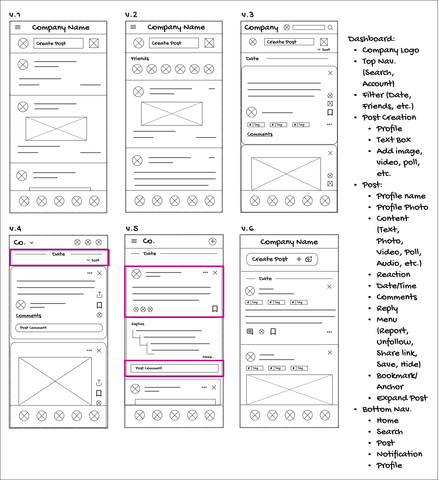
Using my past experience of working with minimal guidance, I made initial drafts to elicit feedback from collaborators/stakeholders. This helped them articulate their vague ideas better, then we could refine those ideas faster.

Wireflow

Wireflow example showing Dashboard actions
Dashboard Wireflow
Before starting the mockups, I created a wireflow from Troo's past research, conversations, wireframes, notes, and iterations to visualize how the user would interact with the concept app.

Design

Mockups

Explore Page Wireframe
Early wireframe showing pre-chosen topics on the explore page and how they would expand
Earlier versions listed pre-chosen topics that expanded into a gallery view
Explore Page Mockup
Explore Page Mockup showing progression from search page to search results
Later versions focused on user choice (searching)  & tabbed topics once searched
Explore Page Topics
Explore page mockup example showing how the manage button brings up topics to remove
“Manage” button gives users an easy way to remove offensive or triggering topics.
Users expressed an interest in having autonomy over suggested topics. To support this, I simplified the page to a search button and a small list of trending topics. Users are given a ‘Manage’ button to allow them to remove triggering topics easily.
Designing for a concept app made me change my approach. By incorporating more colorful, eye-catching screens than the MVP, we hoped to attract more users to the website. Screens highlighted competitive advantages, leaving out distracting details.

Early Prototypes

Switch Profiles Prototype
Switch Profiles Overlay

Allows user to switch between multiple profiles
Privacy Settings Prototype
Privacy Settings

Users can adjust their privacy settings
Timer Prototype
Timer / Reminder

Users can set a reminder to stop the scrolling
Constraint

The Creative Director wanted a higher quality GIF without the phone frame and on a transparent background. Screen recordings were a bit choppier than we wanted.

Solution

Though I tried (free) Figma plugins, websites (like Artboard Mockup), computer software, and more, each was missing something. So, I kept searching for options and eventually found a solution with Adobe Photoshop.

Final Prototype Animations

GIF Showing the Final Animation of Switching Between Different User Profiles on the Concept App
Switch Profiles Overlay
GIF Showing the Final Animation of Setting Up Privacy Settings on the Concept App
Privacy Settings
GIF Showing the Final Animation of Setting a Timer, Scrolling Through the Dashboard, and the Countdown Ending on the Concept App
Timer / Reminder
After research, I found that Photoshop has an animation function. After viewing a few tutorials on how to speed up the animation creation process, I created the final animations above.

Photoshop Animation Features:

Smoother Transitions
Choose Dimensions
Higher
Quality
More Customization
Transparent Background
Constraint

Mobile devices could not play back the GIF on such large files for each frame-by-frame Photoshop animation. We needed a way to reduce the size of the files without losing quality.

Solution

Reducing the number of frames and colors when I was able without reducing quality helped reduce file size. Files were also converted to a WEBP file extension to save space while still allowing a GIF with transparent background.

Key Takeaways:

Though it was time-consuming to switch between different file formats and learn ways to reduce the file size, I now know several new shortcuts.

Despite previous experience telling me that layering a GIF beneath a mask may not work on all devices, I followed the directions. Next time, I will be more assertive about what’s best to save myself time.

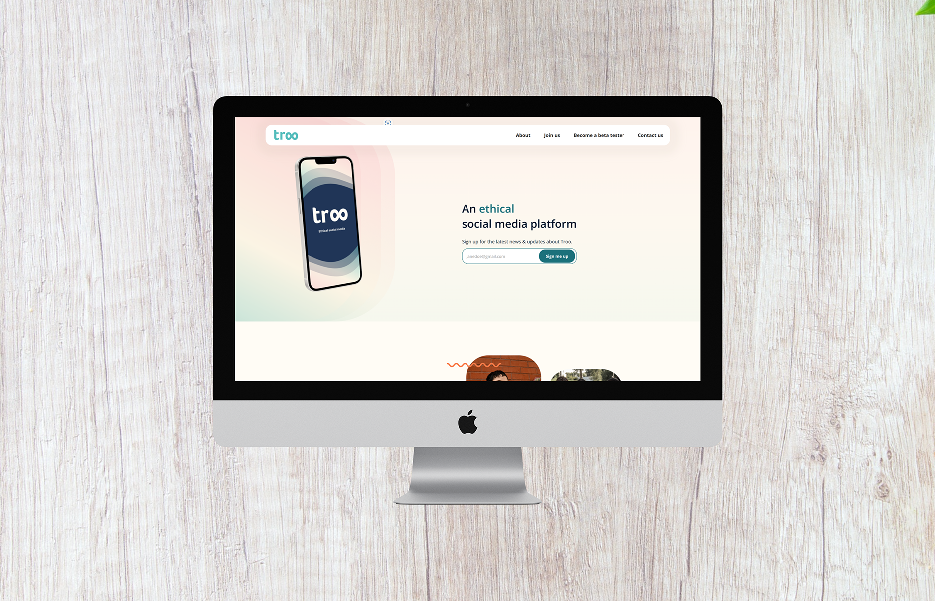
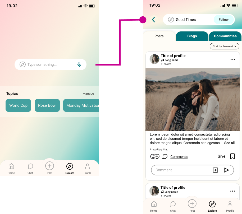
We wanted to incorporate a scrolling version of the dashboard in perspective. After running into several issues, we had to settle for a static image. Sometimes we have to improvise and revisit it later.

Revisions

GIF Showing Troo's Logo Before Scrolling Through the Dashboard on a Phone
Although we did not have this ready for the launch of our redesigned website, I never give up. I did eventually find a way to create this scrolling version in perspective.

LEARNINGS + LESSONS

Collaboration Is Great

It’s always helpful to hear different perspectives and get feedback, whether it’s used or not.

Say it Loud and Clear

I learned to share more ideas with the group, especially since I have different expertise.

Improve Communication

Getting to know how everyone works helps me improve communication and work more efficiently.

⟵ Home-Based PreK Wiener Waggin' Catering ⟶