⟵ Back to Home
Wiener Waggin’ Catering - Reinventing the service experience for increased revenue
Helping customers better understand what Wiener Waggin’ Catering offers and creating an easier way to book an event to bring in more interest among customers.
Team
Business Manager, Product Manager, UX Designer
Tools
Figma, Excel, Google Products & Services, Typeform, Go Daddy
Timeline
4 months
Wiener Waggin Homepage on different devices
Wiener Waggin' Website

Overview

Wiener Waggin’ is a small, family owned hot dog cart that serves on-site to the public and caters at private events. Wiener Waggin’s goal is to become more well known for providing affordable food at events so everyone can enjoy themselves.

Role + Impact

I was tasked with updating the existing website to be more user friendly and bring in more customers. As part of this, the owner expressed interest in adding any other features I saw fit to reduce user pain points. We accomplished this by:

Problem Statement

Design a website that helps customers:
First
Know Wiener Waggin’ and what sets them apart
Second
Feel confident enough to book the event
Third
Book the event easily and quickly
Not doing so would mean less profit with fewer customers navigating to, staying on, and booking events through the website.
Given that the owner already had a lot of in-depth knowledge of their target audience, I did not need to start from scratch with foundational research such as interviews.

RESEARCH

Initial Research

After speaking with the owners about all things Wiener Waggin’, they shared that their target audience was women in their 30’s with a household income of at least 100k.
I wanted to verify their target audience before diving into the designs, so I:
Did secondary research
Created a survey for past customers
Read through reviews
Perused social media posts looking for caterer recommendations
Spoke informally with people looking for caterers
Problem

We ran into some issues getting a response from some past customers on the survey.

Solution

I remained flexible by using the available data and proceeded with the rest of the research

Empathy Map

Empathy Map
Aggregated Empathy Map
After synthesizing my research, I concluded that the main target audience was:
Women in Late 20’s - Early 50’s
Household income 100k+
Has expensive tastes
Pays for other services
Another insight I gleamed from my foundational research: users are looking for ways to confirm that their expectations will be met. I wanted to keep that need in mind when ideating and designing the website.

Personas

Main Persona
Main Persona
Persona 2 Edge Case
Edge Case 1
Persona 3 Edge Case
Edge Case 2

User Wants + Needs

Affordable
Users want services to fit their budget
CONVENIENT
Users want to save time and effort
Friendly
Users want service with a warm smile
Unique
Users want something fun and different

User Journey

User Journey Map
User Journey Map

Translating the user’s journey into actionable steps:

User Journey Steps and Actions to take

Competitive Analysis

Competitive Audit Chart
By comparing competitor websites to Wiener Waggin’ Catering’s current website, I could quickly get an idea of lacking areas, such as not listing a service area, packages, event calendar, recognitions, etc., while also seeing what works best for others.

Content

Content Inventory + Audit

Excerpt from the Content Inventory and Audit Spreadsheet
Content Inventory and Audit Excerpt
Looking at existing pages in depth and comparing them against criteria helped me determine which areas were lacking and which pages to keep.

Insights

Keep
  • Plain language
  • Tone of voice
  • Testimonials
  • Pictures
  • Get Quote button
  • Contact button
Edit
  • Formatting
  • Unclear headings
  • Align content goal
  • Old coupons
  • Social media location
  • Menu items
Add
  • Metadata
  • Service areas
  • Owner Information
  • Additional contact
  • More review links
  • Picture headings
Performance metrics such as page views, revenue, and qualitative insights also helped guide our decisions to ensure we updated the correct information.

Closed Card Sort Analysis

My goal was to test the clarity of the website’s distinction between the company’s catering and hot dog stand services. To do this, I conducted two card sorting studies with users.
During the first card sorting, I had users sort cards into 4 categories:

Findings

Users were most unclear on the following after study #1
Categories
  • "Find Us"
  • "Packages"
Topics
  • FAQ's
  • Public hot dog cart details
  • Owner’s availability
  • About the owner
Recognizing a trend that users were categorizing information into 3 main categories (Catering, Public Events, and About), I ran a second card sorting study with the adjusted categories.
Card sorting #2 with the new categories showed more consensus among users. This informed the website’s information architecture and revealed users’ mental models.

Site Map

Site Map
Site Map
Basing the site map off of the card sort analyses conclusions, I changed the navigation tabs.
New Tab
Old Tab
Packages & Past Events
Converted To
Catering
Find Us
Converted To
Public Events
Contact
Converted To
About

User Flow

User Flow Chart
User Flow Chart
Visualizing the user flow as I organized the website helped me ensure it will meet user needs and goals.

IDEATION + DESIGN

Storyboards

Big Picture Storyboard
Close Up Storyboard
Close Up Storyboard
Overall, we wanted to ensure that the user can meet their ultimate goal: booking an event with Wiener Waggin’. Giving users what they need to feel confident and an easy way to do this will ensure success.

Sketches

Wireframe Sketches of the Homepage
Homepage Sketches
I used a number of techniques to come up with ideas quickly, such as Crazy 8’s and How Might We’s. Drawing out ideas in different formats helped me decide which I preferred to incorporate into the wireframes.

Wireframes

Wireframe Showing Fixed Navigation at the top of the page
Contact information and service areas are in the fixed top navigation for easy access for when users are ready to take action.
Homepage Wireframe
Wireframe Showing Use of Headings, Sections, and Dividers to quickly communicate information
With sections and headers, users can easily see what makes Wiener Waggin’ unique.
Homepage Wireframe
My goal was to help users grasp information in a simple and fast way, so I strategically placed key details on each page and split remaining information into small chunks.

Mockups

Mockup Showing Warm Colors and Inviting Pictures
Using warm, hot dog based colors and friendly pictures helps communicate the company’s warm and friendly service.
Homepage Mockup
Mockup Showing Picture Gallery
To match users’ wish to know the experience before booking, I added pictures of the hot dog cart in action.
Public Events Page Mockup
The goal of adding details to the website mockups was to convince users that the company provides reliable, warm, and low-cost service.

Prototype

High Fidelity Prototype screenshot with notes
Prototype Notes
Problem

The owner had a hectic schedule and could only spare a few minutes on a sporadic basis to check the website’s details.

Solution

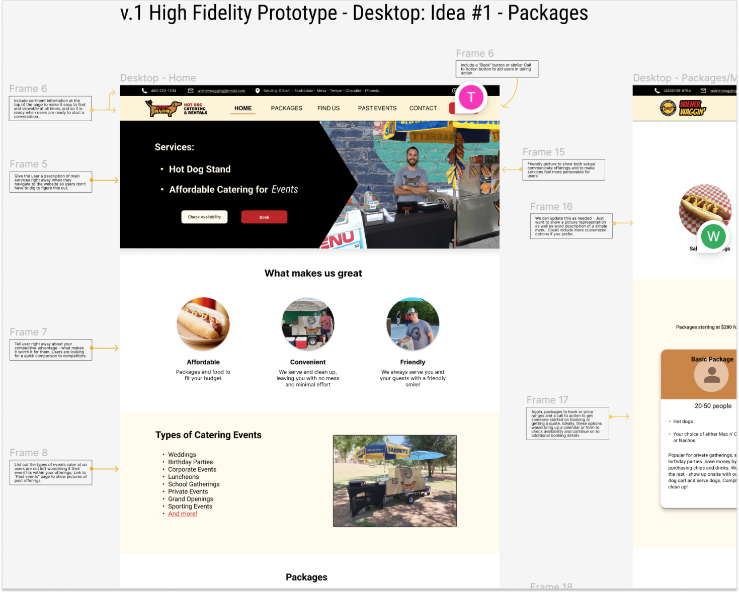
I added notes connecting the research to the website design choice. The owner and I could then leave comments throughout the document to discuss, and we met virtually when we could.

Design System

Design System
Wiener Waggin’ Design System
A design system helped me maintain consistency in the designs and makes it easier for the company to modify and expand the website design in the future.

Evaluative Research

Usability Study

Unmoderated
10-15 minutes
18-55 year old
I recruited adults who were looking for someone to cater an event of at least 50 people, or who have catered an event of at least 50 people in the last 6 months.

Findings + Pain Points

First
The website was easy to navigate for users, who made few errors and completed their tasks quickly.
Second
Users were curious about the “hot dog stand” tab and wondered what it contained, but they understood it clearly once they clicked on it.
Third
Users had about a 1 second delay to spot the contact details and the “Get Quote” button on the top navigation.
I analyzed the results of the usability study and prioritized improvements that should be made to the website. After making the changes, I conducted another usability study before updating the website and going live.

Final Design

Lessons + Learning

Set Up Expectations

Clear expectations from the start make things run more smoothly.

Share Research

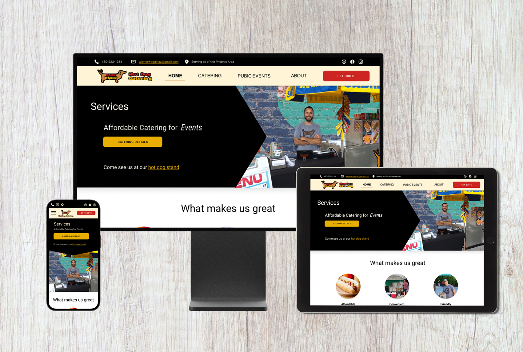
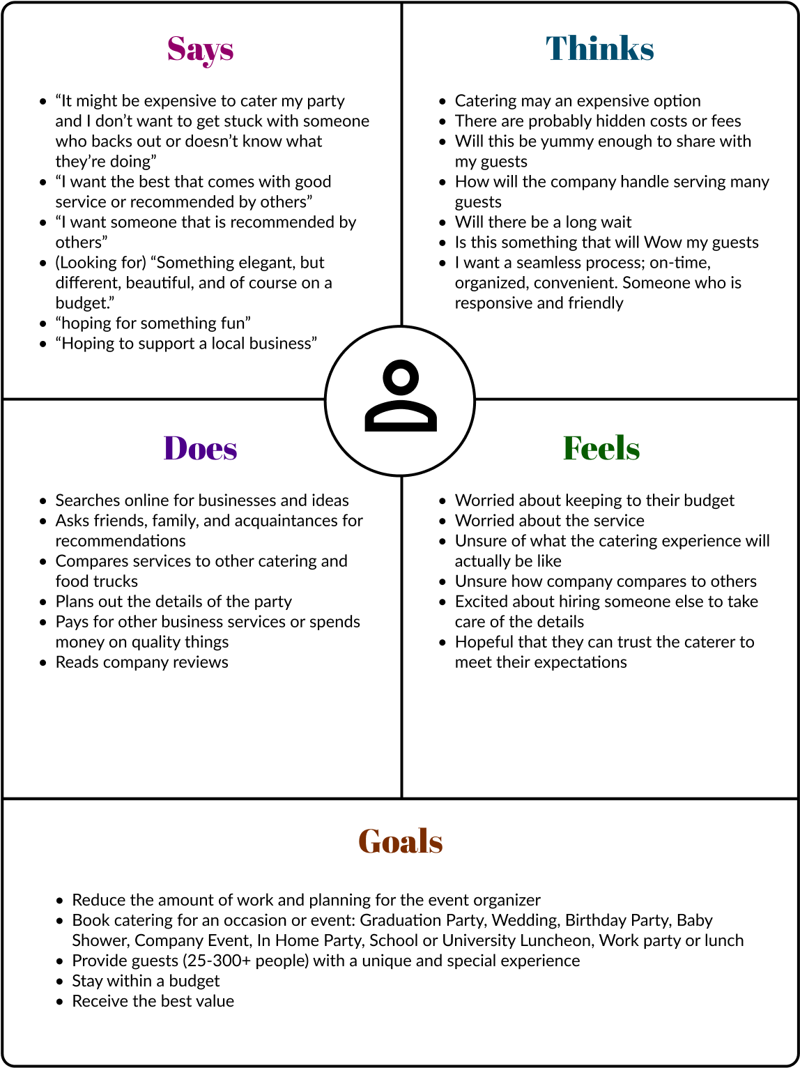
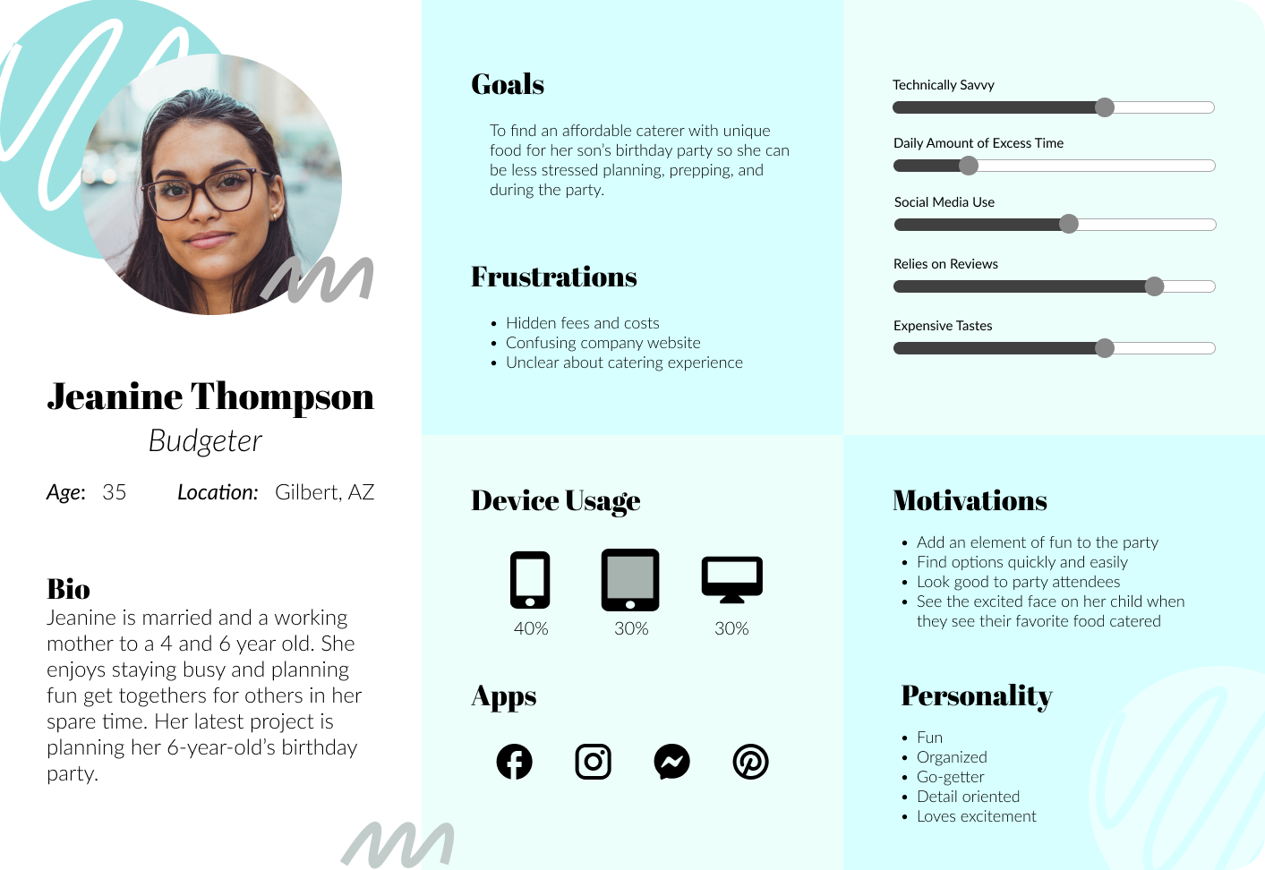
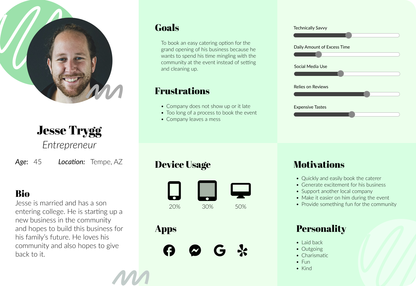
Sharing research helped others imagine how changes affect users.

Be ready to Improvise

Being inventive and adaptable helped me conquer any obstacles.

⟵ Troo Case Study University of Phoenix ⟶